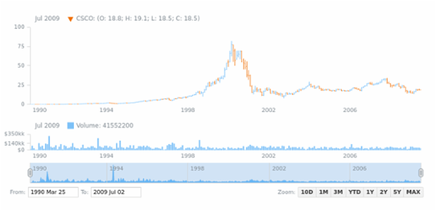
OHLC Chart
The OHLC (Open-High-Low-Close) Chart is typically used to illustrate the movement in prices over time.
Each data point is depicted as a vertical line representing the price range between the lowest and highest prices over a certain time period, with tick marks on the left and on the right indicating respectively the opening (first) and closing (last) price for the time unit in question.The color of each data point reflects whether the price decreased or increased during that period.
Each data point is depicted as a vertical line representing the price range between the lowest and highest prices over a certain time period, with tick marks on the left and on the right indicating respectively the opening (first) and closing (last) price for the time unit in question.The color of each data point reflects whether the price decreased or increased during that period.
Similar Charts
Resources
View more samples in our gallery:
Read more information in our documentation:


