OHLC Chart

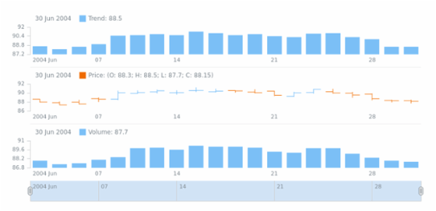
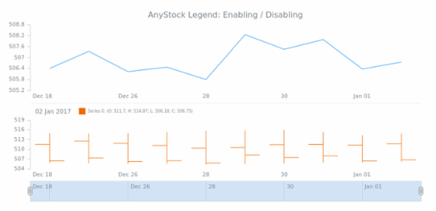
An OHLC (Open-High-Low-Close) Chart is a financial chart used to illustrate price movements over time. Each vertical line here shows the price range (the highest and lowest) and has tick marks which show the opening price(on the left) and the closing price (on the right). It is rather similar to Japanese Candlestick chart but lacks the colored body. OHLC is a series type that is predominantly used for demonstrating the stock market data, due to its specifics.

Right padding created by anonymous

Right padding

By anonymous, Oct 9
STOCK Axes 01 created by anonymous

STOCK Axes 01

By anonymous, Jul 8
STOCK Axes 02 created by anonymous

STOCK Axes 02

By anonymous, Mar 9
STOCK Basic Sample created by anonymous

STOCK Basic Sample

By anonymous, Mar 21
STOCK Basic Sample created by anonymous

STOCK Basic Sample

By anonymous, Aug 3
STOCK Basic Sample created by anonymous

STOCK Basic Sample

By anonymous, Oct 5
STOCK Basic Sample created by anonymous

STOCK Basic Sample

By anonymous, Oct 23
STOCK Basic Sample created by anonymous

STOCK Basic Sample

By anonymous, Mar 16
STOCK Basic Sample created by anonymous

STOCK Basic Sample

By anonymous, Dec 15
STOCK Basic Sample created by anonymous

STOCK Basic Sample

By anonymous, Mar 4
STOCK Basic Sample created by anonymous

STOCK Basic Sample

By anonymous, Sep 6
STOCK Basic Sample created by anonymous

STOCK Basic Sample

By anonymous, Nov 29